NotesIn a previous article, I created a concept for in-car climate controls focusing on simple, physical controls. I've now found the time to turn this concept into reality through a rotary dial with dynamic haptic feedback. Along the way, I tested what makes dials feel intuitive, explored haptic design principles, and compared my approach to what carmakers are doing today.FeedUnfurl
NotesReady for the second set of loaders? Yes, it's again me with another collection of 100 CSS loaders. Now you have a total of 200 different loaders!Unfurl
NotesWhen
doing user interface design, it is possible to make the interface to be
user friendly (less user control) or user empowered (more user control).
However, it seems that user friendliness and user empowerment are two
extremes and being against each other. Usually we can only make a
choice between them. But is it the best we can do?Unfurl
Notes A UI concept which merges loading indicators into the action that invoked them. Primarily intended for use with forms where it gives users immediate feedback upon submit rather than leaving them wondering while the browser does its thing. For a real-world example, check out any of the forms on slid.es. Unfurl
NotesBut buttons are discoverable. They can have labels that describe what they do. Everybody knows how to use them. They just work. It’s why we use them to turn on the lights, instead of installing Clappers everywhere.FeedUnfurl
NotesAs designers, we all know that on-screen soft keyboards are cumbersome and rather slow to use due to their lack of physical texture and haptic feedback. And with the continual rise of touch screens on phones, tablets, and laptops, we got excited about giving the chorded keyboard another chance!Unfurl
NotesI can understand the impulse here: Most scrollbars are kind of ugly. Even the skinny, rounded gray bar that Apple invented for the iPhone isn’t the prettiest interface element ever designed. But as unpleasant as they may be to look at, scrollbars serve a purpose on a busy screen: They tell you, at a glance, where you are in a list or a document. Because most modern scrollbars are proportional to the size of the document you’re looking at, they also give you a sense of how much lies off-screen—the smaller the scrollbar, the larger the document. And when you don’t see a scrollbar—or when the scrollbar is dimmed—this usually means there’s nothing outside the screen to look at.Unfurl
NotesA skeuomorph, pronounced /ˈskjuːəmɔrf/ SKEW-ə-morf, or skeuomorphism (Greek: skeuos—vessel or tool, morphe—shape)[1] is a derivative object that retains ornamental design cues to a structure that was necessary in the original.FeedUnfurl
Notes"If you swipe your finger on the notification bar (with the panel still up), you can change your brightness, anywhere that bar is present! Useful when auto brightness isnt on and you need a quick brightness change"Unfurl
Notes"Have you ever filled a textarea on a page, which had a limit to how many characters you could type into it? ... How to effectively communicate how many characters you can type into a box, and have it look good. ... Add the number counter as the background of the textarea!"Unfurl
Notes"One of the pieces of feedback in our recent survey was that add-on developers really wanted to remove the login requirement for experimental add-ons. So we did it."FeedEmbedUnfurl
Notes"jQuery pageSlide was inspired by the UI work of Aza Raskin. In his recent posts regarding concepts for Firefox Mobile and a mouse-based Ubiquity, Aza introduced the idea of sliding (or "throwing") content aside to reveal a secondary content pane."Unfurl
Notes"You don’t really know a subject until you’ve had to teach it. In the same way, you don’t really understand your interface until you’ve written a manual explaining how to use it. It can be a frustrating experience. Take for example the two manuals for digital watch and analog watch. The section on setting a digital watch is over a page of dense, difficult explanation. The analog’s is a single sentence: “Pull crown and turn.”"FeedEmbedUnfurl
Notes"Poka-yoke (ポカヨケ, Poka-yoke?) (IPA: [poka joke]) is a Japanese term that means "fail-safing", "Foolproof" or "mistake-proofing" — avoiding (yokeru) inadvertent errors (poka)) is a behavior-shaping constraint, or a method of preventing errors by putting limits on how an operation can be performed in order to force the correct completion of the operation."FeedUnfurl
Notes"1. Padded block links 2. Typesetting buttons 3. Using contrast to manage focus 4. Using color to manage attention 5. White space indicates relationships 6. Letter spacing 7. Auto-focus on input 8. Custom input focus 9. Hover controls 10. Verbs in labels"FeedUnfurl
Notes"Science Fiction movies have been a source for speculation about the future of technology and human computer interaction. This paper presents a survey of different kinds of interaction designs in movies during the past decades and relates the techniques of the films to existing technologies and prototypes where possible. The interactions will be categorized with respect to their domain of real-life applications and also evaluated in regard to results of current research in human computer interaction."Unfurl
Notes"Ubiquity is a graphical keyboard user interface. But a lot of people are missing the graphical aspect of it. And that is precisely what makes Ubiquity different from a command line. Command icons help but previews have to be more visual, not just the plain text that you would normally expect from the terminal. I can’t emphasize enough the fact that previews must be graphical because after all, Ubiquity is a GUI."Unfurl
Notes"you know how more and more sites out there are adopting a m.* mobile version, tailored for smaller screens? Why don't the video sites out there start adopting tv.* versions of their interfaces, tailored to people using the site from their couch?"FeedUnfurl
Notes"Our new project attempts to alleviate all of these problems by allowing end-users to apply textual commands, or verbs, to whatever they’re looking at."Unfurl
Notes"Do you have a wearable computer? Are you interested in alternate keyboard layouts but too lazy to learn Dvorak? Do you masturbate at your desk?"Unfurl
Notes"Gmail uses Ajax to accelerate common operations ... but its core look and feel remains very similar to that of a traditional web page. In my view, this is not a shortcoming; it’s a smart design decision."FeedEmbedUnfurl
Notes"So now command line interfaces are back again, hiding under the name of search. ... And they will get better and better with time: mark my words, that is my prediction for the future of interfaces."Unfurl
Notes"Split Panes probably do have their place and purpose, but after using both of these applications I’m not convinced that reading email is one of them."Unfurl
Notes"In this article, one button is the limitation on interaction. Using this limitation, the reader can then draw their own conclusions about how these ideas may be exploited on multi-button interaction systems."Unfurl
Notes"In other words, it may soon be possible for budding Bene Gesserits, with appropriate training, to receive volumes of material via the sensitive parts of the body."Unfurl
Notes"The user interface is a pair of illuminating gloves that can be used to track intuitive hand gestures like grabbing, pulling, reaching and rotating."Unfurl
Notes"Kupu is a 'document-centric' open source client-side editor for Mozilla, Netscape and Internet Explorer. Inspired by Maik Jablonski's Epoz editor"Unfurl
 Chatbots are AI anti-patterns! | Jakob Pörschmann
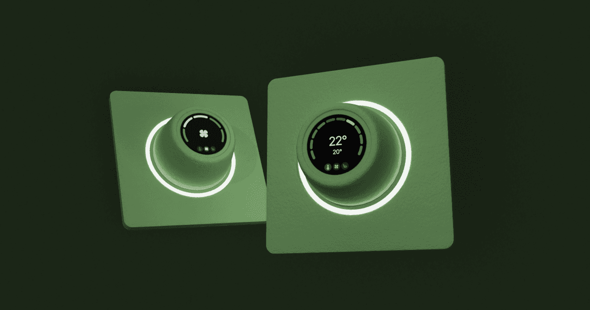 The Subtle Art of Designing Physical Controls for Cars
 Another 100 CSS loaders for your next project - DEV Community 👩💻👨💻
 ignore the code: Buttons
 Computer scrollbars: Why is Apple eradicating a linchpin of user interface design? - Slate Magazine
 Skeuomorph - Wikipedia, the free encyclopedia
 jQuery pageSlide - Halobrite
 Poka-yoke - Wikipedia, the free encyclopedia
 10 Useful Techniques To Improve Your User Interface Designs | How-To | Smashing Magazine
 A thought on 10 foot browser interfaces - RussellBeattie.com
 Ubiquitous Interfaces, Ubiquitous Functionality at Toolness


