NotesIn a previous article, I created a concept for in-car climate controls focusing on simple, physical controls. I've now found the time to turn this concept into reality through a rotary dial with dynamic haptic feedback. Along the way, I tested what makes dials feel intuitive, explored haptic design principles, and compared my approach to what carmakers are doing today.FeedUnfurl
NotesReady for the second set of loaders? Yes, it's again me with another collection of 100 CSS loaders. Now you have a total of 200 different loaders!Unfurl
NotesWhen
doing user interface design, it is possible to make the interface to be
user friendly (less user control) or user empowered (more user control).
However, it seems that user friendliness and user empowerment are two
extremes and being against each other. Usually we can only make a
choice between them. But is it the best we can do?Unfurl
NotesI can understand the impulse here: Most scrollbars are kind of ugly. Even the skinny, rounded gray bar that Apple invented for the iPhone isn’t the prettiest interface element ever designed. But as unpleasant as they may be to look at, scrollbars serve a purpose on a busy screen: They tell you, at a glance, where you are in a list or a document. Because most modern scrollbars are proportional to the size of the document you’re looking at, they also give you a sense of how much lies off-screen—the smaller the scrollbar, the larger the document. And when you don’t see a scrollbar—or when the scrollbar is dimmed—this usually means there’s nothing outside the screen to look at.Unfurl
Notes"We're happy to announce support for the OpenID OAuth Hybrid Protocol, which combines OpenID authentication (sign in) with OAuth authorization (access control) in a single interface. The Hybrid Protocol makes it easy for the hundreds of millions of Yahoo! users to sign into websites with a Yahoo! account, and to enable two-way data sharing of their Profile, Contacts, and Updates, without having to register a new site-specific account or share their Yahoo! password."Unfurl
Notes"Have you ever filled a textarea on a page, which had a limit to how many characters you could type into it? ... How to effectively communicate how many characters you can type into a box, and have it look good. ... Add the number counter as the background of the textarea!"Unfurl
Notes"design patterns are solutions to recurring problems. By extension, UI design patterns are solutions to common user interface problems. This article goes over 10 interesting UI design patterns that you can use in your own projects. In fact, you may already be using them now without knowing it."Unfurl
Notes"Poka-yoke (ポカヨケ, Poka-yoke?) (IPA: [poka joke]) is a Japanese term that means "fail-safing", "Foolproof" or "mistake-proofing" — avoiding (yokeru) inadvertent errors (poka)) is a behavior-shaping constraint, or a method of preventing errors by putting limits on how an operation can be performed in order to force the correct completion of the operation."FeedUnfurl
Notes"1. Padded block links 2. Typesetting buttons 3. Using contrast to manage focus 4. Using color to manage attention 5. White space indicates relationships 6. Letter spacing 7. Auto-focus on input 8. Custom input focus 9. Hover controls 10. Verbs in labels"FeedUnfurl
Notes"Science Fiction movies have been a source for speculation about the future of technology and human computer interaction. This paper presents a survey of different kinds of interaction designs in movies during the past decades and relates the techniques of the films to existing technologies and prototypes where possible. The interactions will be categorized with respect to their domain of real-life applications and also evaluated in regard to results of current research in human computer interaction."Unfurl
 Chatbots are AI anti-patterns! | Jakob Pörschmann
 The Subtle Art of Designing Physical Controls for Cars
 Another 100 CSS loaders for your next project - DEV Community 👩💻👨💻
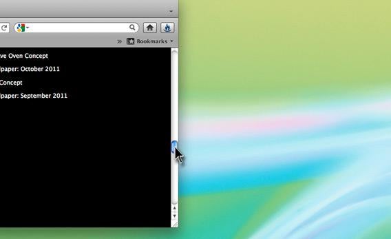 Computer scrollbars: Why is Apple eradicating a linchpin of user interface design? - Slate Magazine
 A Brief Rant on the Future of Interaction Design
 Poka-yoke - Wikipedia, the free encyclopedia
 10 Useful Techniques To Improve Your User Interface Designs | How-To | Smashing Magazine